How To Create A Basic Social Media Graphic In Photoshop For Beginners – Hello Viewers, Today Presenting Social Media Post Graphic Design Tutorial in Adobe Photoshop. This tutorial is about creating a social media graphic design for social media posts. Currently, social media platforms are considered as marketing platforms. Sellers and traders do not advertise their products here. In a word, we can easily promote any service or any product in our state through social media platform. For this you need to design a professional level banner. That is why I have this lesson today. In this tutorial, I will show you how to create a creative social media post using Photoshop.
In this tutorial, I show you how easily you can highlight your products and design a beautiful and professional banner. You can use this social media banner on various social media platforms like Instagram, Facebook, LinkedIn, etc. These banners are usually in square shape and its standard size is 1080×1080. So without further ado let’s start the actual tutorial. If you want to design your own social media posts, let us know
How To Create A Basic Social Media Graphic In Photoshop For Beginners
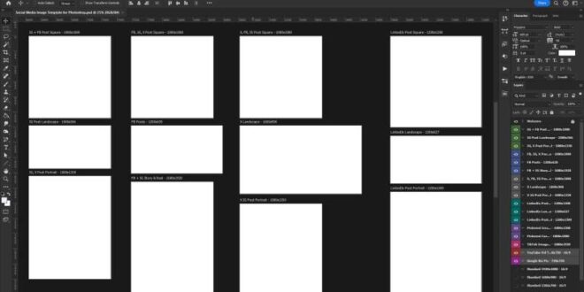
Everyone knows that if you want to design, you have to create an art board. Where we design is called the Design Artboard. Anyway, let’s open the Photoshop program from our computer. Now create a design artboard document as per the screenshot. After opening Photoshop press Ctrl+Shift+N to create a new design document. Now name this document. Here I put “Social Media Post Design” as document name. You can name it whatever you want. Then I put the size – width 1080 and height 1080 and resolution 300. Make sure you select pixels from the dropdown box. Then set the color mode to RGB color. As we are creating banners for social platforms, we need to choose RGB color mode. If we were to design this banner for print, we would use CMYK mode. After that, click on the blue Create button. After clicking the blue Create button, your design artboard will appear.
Photoshop For Beginners
Since this design is about a clear product banner, I have used a mobile phone image as the product image here. You can bring products with similar images. However, we will take the black background color behind the product. Then we use mobile screen color as background color.
However, after opening Design Artboard, our first task will be to import stock images from Computer Store into Design Artboard. To do this, click File > Open, then select a stock image and click Open. After bringing in the stroke images, let’s create a background layer using the rectangle tool and select black as the temporary color. Now create a new layer. Then select the brush tool (make sure you select a soft round brush from there.) I used an 800 brush. Now we use a slightly lighter color than the background and tabs on the design canvas. Then place the product image (layer 1) brush on top of layer 2. Now we go to the next step.
In this step, we will apply shadows and lighting effects to the output layer. First, we apply shadows and then lighting effects for the mobile screen. To do this, we need to create a black fill layer because we need a shadow effect on top of the mobile screen. To create a fill layer, click the ball icon to create a new fill and adjustment layer. A and create a color fill layer and change the color to black. You may notice that the color fill layer is named “Color Fill 1”, and it has a white layer mask. Now we need to change the layer mask. To change the layer mask, click on the color fill 1 layer white mask area. And press Ctrl+I to change the layer mask area from white to black. Then hold Alt+Ctrl+Shift and click on the Color Fill 1 layer to move this layer to the output (mobile) layer. Now select a soft round brush and make sure the foreground color is black. Now draw the brush on the product layer (mobile).
Now we apply the lighting effect to the product (mobile) layer. For this, we need an image with a light effect on a black background. Now we bring the image layer on top of the image in our product (mobile) layer. Then set the layer mode normal color to Dodge and create a duplicate layer of it by pressing ctrl+J. Then we’ll add a layer mask to both layers by clicking the layer mask icon. Now we will not change the layer mask. We will make the selection at the product (mobile) level. To do this, hold Ctrlf from the keyboard and click on the output layer. After that, you will see the selection symbol that will be visible around the mobile. Now click on layer mask layer 5. Select a (hard round) brush from the Brushes panel. And dip mask area to remove unwanted light area. Then do the same with layer 5 copy.
Expand Any Photo With Ai Generative Expand In Photoshop
In this step, we will highlight this lighting effect. To do this, we need to create another duplicate layer of layer 5. You already know the way, how to create a duplicate layer. Activate the layer you want to duplicate and press Ctrl + J. Now we will apply a blur effect to this copied layer. To do this, go to Filter > Blur > Gaussian Blur. As you can see in the screenshot, now we set the Radius value of Gaussian Blur. I make this radius 19.4 pixels. Then change the Layer Mode to Line Dodge (Add). After that, you will see that the light will be brighter. I hope you understand this.
In the last step, we will add reflection to the output layer (mobile). To duplicate this, we need to create a duplicate product layer. Then press Ctrl+T to transform the layer freely. Now we will add a layer mask by pressing the mask icon. As you can see in the screenshot I marked the mask image. Now turn on the layer mask, then click on Gradient from the left menu bar. Select the transparent fill gradient from here. Then, drag the gradient ball down. When you do this, you will see the copied output layer. It will disappear.
If you still have trouble understanding, you can watch my video tutorial. I am here today to say goodbye. Thanks for patiently reading the article.
 Alveo Creative Blog Guiding users through techniques for enhancing images, retouching portraits, and mastering popular editing software
