Step By Step Guide To Using The Color Picker In Photoshop For Design – All categories The art in the collections Create a bundle Create a powerful art license library Creative workflow planner Log in
2025 Trend Report Retro Charms Stamp Brushes – 5 Pack Mini Collection Tear Sheet Templates Product Collections Deck Creative Business Bundle Creative Asset Bundle Collection Guide
Step By Step Guide To Using The Color Picker In Photoshop For Design
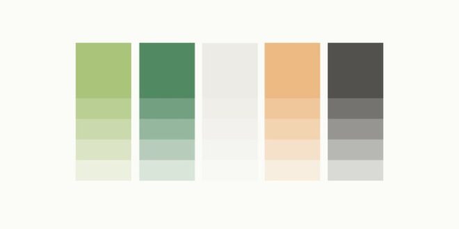
Want to learn how to create a custom palette? In this tutorial, I’ll walk you step-by-step through creating a palette in Photoshop. I see budding artists get stuck in colors when they start creating art. Color is an essential part of any image, but it’s not always easy to know where to start.
How To Fill Text With An Image In Photoshop? Put An Image In Text
In this tutorial I’m going to show you how to create beautiful custom palettes by sampling colors from reference images.
You can download a copy for free here. Just scroll down, enter your email address and you’ll be taken to a Dropbox folder where you can download the color chart.
To make your own color palette worksheet, just draw some black squares in Photoshop, leaving room to drag an image for reference. We fill the black boxes with colors to create a palette.
Start by opening a color worksheet file in Photoshop. If you are making your own coloring worksheet, build it the same way as in the picture above. You can find great reference images on Unsplash – a free photography site.
How To Change The Color Of Text In Photoshop
In this example, I will show you how to display colors from the upper left corner of a worksheet.
This is a great example of an extra color combination. Blue and orange are directly opposite each other on the color wheel, which tells me that this will be a nice and balanced color palette. Plus, the image features neutral elements, which are always great to include in your palettes.
When you look at the reference image, think through the different shades you want to try for the palette. I always like to make the top row of palettes with darker shades and then fill the bottom with lighter shades of the same shades.
In this example, the two primary colors are blue and orange. So I know to start by trying a darker blue and a darker orange.
How To Make Your Own Color Palettes
I also like to incorporate neutrals into my palettes. This gives me a lot of flexibility and adds interest to the piece than sticking to straight white or straight black. In this photo, I’ve noticed that they have a nice charcoal gray and some lighter off-white grays that I can use for the neutrals.
Once you’ve looked at your photo and have a general idea of the colors you want to choose, it’s time to start swatching!
The easiest way to start sampling colors to create a palette is to use the Eyedropper tool. You can find this in the sidebar or select it with the hotkey “i”.
With the eyedropper tool selected, start by hovering over one of the colors you selected in the previous step. Then click to see a color swatch. I start with a darker orange and I can tell it’s a sample because the foreground color in the color picker has changed to a dark orange.
A Beginner’s Guide To Color Curves For Powerful Correction
Now that you’ve taken a color sample, you’ll want to add it to one of the black boxes below the image. Select the Paint Bucket Tool either by clicking on it in the toolbar or by tapping “g” on your keyboard.
Now your paint bucket is loaded with the color you just sampled and all you have to do is click on the black square to fill it.
Repeat these steps, switching between the Eyedropper Tool and the Paint Bucket Tool to fill the rest of the palette. In my example, I took navy blue and dark charcoal to fill the top row of the palette.
Then I repeat the process, taking the lighter color from each top color in the bottom row.
Color Grading In Photoshop
If you don’t like the color of your samples, that’s okay! You can just switch back to the Eyedropper tool and keep swatching until you find the shade you want.
In my example I used a very light gray as the final color and I didn’t like the way it looked. So I switched back to the Eyedropper tool to find a darker color.
The only problem was that since I had filled the box with a light color that was very similar to the white background, my entire background was filled with a new dark gray.
The reason was that the colors were so similar and the tolerance was too high with the default value of 32.
Four Essential Color Modes In Photoshop: Optimize Your Designs
In order for the Paint Bucket tool to separate two white colors, you need to set the tolerance lower. I set mine to 1 and it was only able to paint that square instead of the whole background.
If you’ve been following along using the free color chart I’ve provided, you can fill in the rest of the palettes. Mine looked like this at the end. Your color may look completely different, but that’s the beauty of custom palettes. You will be able to create something completely personal to you that reflects your unique vision.
The best thing about this color palette creation is that you can do it with any photo! I especially enjoy using my own travel photos to create palettes. This gives my colors a unique personal touch and is just plain fun!
I hope you enjoyed putting together a color palette today! If you have any questions, let me know in the comments!
How To Easily Create A Pastel Color Palette In Photoshop
My own class, Cultivating Color, is an in-depth guide to everything you need to know about color. In this tutorial, you’ll learn step-by-step how to turn a piece of art into a vibrant collection of color options using a few simple tools in Adobe Photoshop.
There is a strategy in choosing palettes that sell well. More color options = more sales opportunities! For each image, I create five to ten different color options from the original artwork. That means I am
Photoshop, photoshop tricks, photoshop techniques, photoshop tutorial, photoshop basics, photoshop for artists, photoshop hack, learn photoshop, edit in photoshop, adobe photoshop, remove background in photoshop, learn photoshop online, art, artist, artist resources, cat, , cat Coq, cat coquillette, remove background, remove, remove background, remove object in photoshop3 Comments supported by readers. Product links are referral links. If you use one of these and buy something, we make a little money. Need more information? See how it all works here.
Mastering the eyedropper tool in Photoshop can simplify the editing process. The purpose of this guide is to solve the complexities of this tool, improve your color matching and ultimately the quality of your work.
How To Use The Gradient Tool In Photoshop (complete Guide)
The eyedropper tool can be found in the toolbar on the left side of the Photoshop interface. It is represented by an icon that looks like a traditional eyedropper.
When you select the Eyedropper tool, the settings bar at the top of the screen changes to reflect its unique settings.
Sample size determines the number of pixels the Pixel Tool displays when you click. The larger the sample size, the more pixels it produces, which can be useful for noisy or grainy images.
The swatch circle shows a sample of the color you are going to display (outer circle) and the selected color (inner circle).
How To Create A Mood Board Template In Photoshop
To sample an average color, expand the sample, then click the area you want. Photoshop averages the colors of the selected points.
You can change the preview in the options bar, allowing you to display different layers or even different documents.
While using the Brush tool, hold down Alt (Option on Mac) to temporarily switch to the Eyedropper tool and sample the color.
In the gradient editor, you can use the Eyedropper tool to select colors directly from your image to use in your gradient.
How To Make A Color Palette In Photoshop — Catcoq
In the color picker window, you can fine-tune the selected color, adjust hue, saturation, and brightness, or enter specific color values.
The colors you select with the eyedropper tool will become the new foreground color. To set the background color, hold down the Alt key (Option key on Mac) as you click.
To save a selected color for future use, click a swatch in the Color Wine window and add it to your palette.
The tool is essential for accurate color matching, especially when editing images or creating complex designs. Just try the color you want to match and use it when needed. Color is hard to work with. No argument, but you know what’s even harder? Combining colors together. Think about the last time you built a palette from scratch. What was your process? What did it look like? If you answered with a more visible *shrug*, keep reading.
Building A Brand Style Guide: How To Create Your Color Palette — Natsumi Nishizumi Design
We covered the basics of what color is and how it works in How to Not Suck at Color, but now that you’re a shade of color
 Alveo Creative Blog Guiding users through techniques for enhancing images, retouching portraits, and mastering popular editing software


