Ever stared at a poster , completely mesmerized? Not by the image itself , but by the typography? The way the words jumped out , grabbed your attention , & whispered their message? That’s the magic of killer poster typography , & it’s totally achievable! Mastering techniques for making typography stand out in posters designed in Photoshop isn’t just about pretty fonts; it’s about making your design sing. It’s the difference between a poster that gets ignored , & one that gets shared, remembered, and even inspires action. Think about it: your poster’s message is only as good as its readability & visual impact. So, let’s dive into how to create truly unforgettable poster designs using Photoshop’s awesome typography tools!
Mastering Typography in Photoshop for Stunning Poster Design
Imagine a poster so visually striking, it stops people in their tracks. The key? Mastering typography in Photoshop! Typography is more than just words on a page; it’s the visual heartbeat of your poster design, conveying your message and creating an unforgettable impact. And Photoshop? Well, it’s the artist’s toolbox, allowing you to craft those unforgettable designs. Let’s dive into the world of typography and unlock its power in Photoshop!
Understanding the Basics of Typography
Before we jump into Photoshop techniques, let’s lay a solid foundation in typography. Think of it as learning your scales before playing a concerto!
Related Post : How To Create Engaging Social Media Posts Using Photoshop For Businesses
Choosing the Right Font for Your Poster
Fonts aren’t just different styles; they communicate different feelings. Serif fonts (like Times New Roman), with their little feet, often feel classic and sophisticated. Sans-serif fonts (like Arial), clean and modern, are perfect for a contemporary vibe. Script fonts evoke elegance and flair, while display fonts—think bold, quirky letters—grab attention.
For example, a concert poster might use a bold sans-serif for the band name and a more elegant serif for the date and venue. Conversely, a minimalist poster might rely on a single, well-chosen sans-serif font. The choice is crucial to setting the right tone.
Font Pairings: Harmony and Contrast
Just like colors, fonts work better together in certain combinations. Pairing fonts successfully creates visual harmony or purposeful contrast. Think of it like this: a classic serif paired with a clean sans-serif creates balance. A bold display font paired with a delicate script can add a touch of whimsy. Avoid clashing styles—two wildly different script fonts, for instance, can be a visual disaster!
- Harmony: Pair similar fonts for a cohesive look.
- Contrast: Pair contrasting fonts to create visual interest.
- Experimentation: Don’t be afraid to try different combinations.
Kerning, Tracking, and Leading: Fine-tuning Your Typography
These are the secret weapons for perfecting your typography. Kerning adjusts the space between individual letters (“A” and “V” might need more space than “A” and “W”). Tracking adjusts the space between all letters in a word or line. Leading (pronounced “ledding”) adjusts the vertical space between lines of text. Mastering these allows you to fine-tune your typography for optimal readability and visual appeal.
- Kerning: Adjust letter spacing for visual harmony.
- Tracking: Adjust overall word spacing for consistency.
- Leading: Adjust line spacing for readability.
Photoshop Techniques for Typography
Now, let’s get our hands dirty with Photoshop!
Creating Text Layers in Photoshop
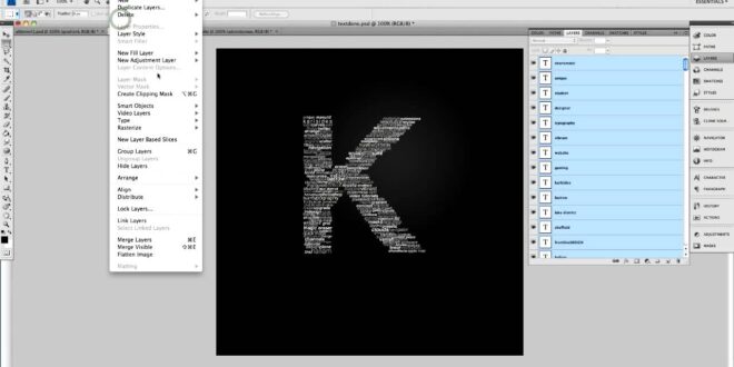
Creating text layers is the first step. Simply select the Type Tool (T), click on your canvas, and start typing. Each text element becomes its own layer, allowing for independent manipulation. This is crucial for flexibility and non-destructive editing.
Using Photoshop’s Text Effects
Photoshop offers a treasure trove of text effects. Drop shadows add depth, outlines improve readability against busy backgrounds, and bevels and embossing create a three-dimensional effect. Experiment to find what works best for your poster’s style.
Working with Smart Objects for Non-Destructive Editing
Smart Objects are game-changers. They allow you to edit your text even after you’ve applied effects, without losing quality. It’s like having an undo button on steroids! Convert your text layers into Smart Objects for ultimate flexibility.
Combining Text with Images
Don’t let your text stand alone! Seamlessly integrate text with images. Use layer masks to reveal or conceal parts of images behind text. Or, carefully position text within the image itself to create a cohesive and visually compelling design.
Poster Design Ideas Using Typography
Let’s explore how typography can be the star of the show!
Minimalist Poster Designs
Sometimes, less is more. A minimalist poster might use a single, powerful font paired with a striking image. The typography becomes the focal point, communicating the message with clarity and impact.
Bold and Dramatic Typography
On the other hand, typography can be the centerpiece of your design. Think large, bold fonts, creative layouts, and even text that forms part of the image itself. This approach works best when the typography is visually stunning and complements the overall message.
Typography-Focused Poster Layouts
There are countless ways to arrange text. Try a grid layout for a clean, structured look; a radial layout for a dynamic, eye-catching effect; or a layered approach for depth and visual interest.
Conclusion
Mastering typography in Photoshop is crucial for creating effective and stunning poster designs. Experiment with fonts, techniques, and styles to find what works best for you and your projects. Don’t be afraid to break the rules and let your creativity shine! Remember, your posters are your visual voice—speak loud and clear! For even more inspiration, check out [link to a relevant resource].
Frequently Asked Questions (FAQ)
Q: What are the best fonts for poster design?
A: There’s no single “best” font. The ideal font depends entirely on your poster’s message and style. Experiment with different fonts to see what feels right for your design. Consider the font’s personality and how it complements your overall visual style.
Q: How can I improve the readability of my poster text?
A: Pay close attention to kerning, tracking, and leading. Choose fonts that are easy to read, especially at smaller sizes. Avoid using too many different fonts, and ensure there’s enough contrast between the text and the background.
Q: What are some common typography mistakes to avoid?
A: Overcrowding your design with too much text is a common mistake. Poor font pairings can also create a jarring visual experience. Finally, make sure your text is legible; even the most beautiful font is useless if it’s hard to read.
(Personal Anecdote): I once designed a poster for a local music festival. I initially chose two script fonts that looked beautiful on their own, but together, they were a complete mess. The text was illegible, and the overall design was chaotic. I learned a valuable lesson that day: font pairing is crucial, and sometimes less is more! I scrapped the design and went with a bold sans-serif for the main title and a clean serif for the supporting text. The result was a poster that was both visually appealing and easy to read.
 Alveo Creative Blog Guiding users through techniques for enhancing images, retouching portraits, and mastering popular editing software


